In our Leaders in Aquatic Design series, our guest experts speak to how good design starts with the end users in mind. A successful aquatic experience is not just a series of features, but a curated flow that provides a sense of narrative, context, and maximizes the guest experience.
But when it comes to creating these spaces, are we always looking through the right eyes?
A Difference in Perspective
Let’s take a look at the automatic hand dryer. For most adult bathroom users, the automatic hand dryer isn’t worth a second thought. But kids, like thirteen-year-old Nora Keegan, have long complained about their excessive levels of noise.
From 2015 to 2017 Keegan used a professional decibel meter to measure the sounds in over 40 public restrooms from different heights and distances for an assessment of how loud these devices actually were. Keegan found several models that reached 121 decibels: significantly higher than the maximum 100 decibels recommended for children.(x).
What this illuminates is the all too common situation in which one user suffers because they experience the same environment with totally different stimuli. In this case, the physical reality for children is different than an adult’s. Kids tend to have more sensitive hearing, and they are physically closer to/underneath the hand dryer, which poses different problems specific to them.
So how do we design spaces for everyone?
Humane Design
It’s important to note that not every facility can service every user need. For instance in play spaces, many needs are competing, with one child needing the space to be loud and energetic and another finding high levels of stimulation distressing. The goal of humane design is to create diversity in spaces, finding solutions that benefit multiple parties. A great example of this is the ADA ramp:
“We tend to think of the ADA ramp as a wheelchair ramp, so perhaps designers are happy to put it in for the 1% of Americans who use wheelchairs, but ultimately you’re creating something that’s going to serve an aberration. When you start including adults who just have difficulty navigating stairs, you wind up serving almost 10% of the population. What about strollers? That’s another 5% of the US population under 5 years old,” our Chief Creative Officer, Sean Rubin, explains when asked about humane design.
Don Norman (author of the Design Of Everyday Things and former Apple VP) points out, in the article I wrote the book on user-friendly design. What I see today horrifies me, the world just gets that much more difficult to navigate the older you are, even for active, healthy adults. “Companies insist on printing critical instructions in tiny fonts with very low contrast. Labels cannot be read without flashlights and magnifying lenses. And when companies do design things specifically for the elderly, they tend to be ugly devices that shout out to the world ‘I’m old and can’t function!’ We can do better.”
And he doesn’t just call for a checklist of changes. He goes on to say, “Do not think that thoughtful design is just for the elderly, or the sick, or the disabled. In the field of design, this is called “inclusive design” for a reason: It helps everyone.”
Or, as our Chief Officer, Sean Rubin, puts it:
“You start life with a mobility impairment, and most people will end life with one. If to have mobility challenges is to be human, design that doesn’t take these issues into account isn’t merely non-inclusive, it’s actually inhumane. This concept is foundational to the design philosophy at Life Floor; good design is helpful to everyone.”
Humane Design Conversations in Aquatics
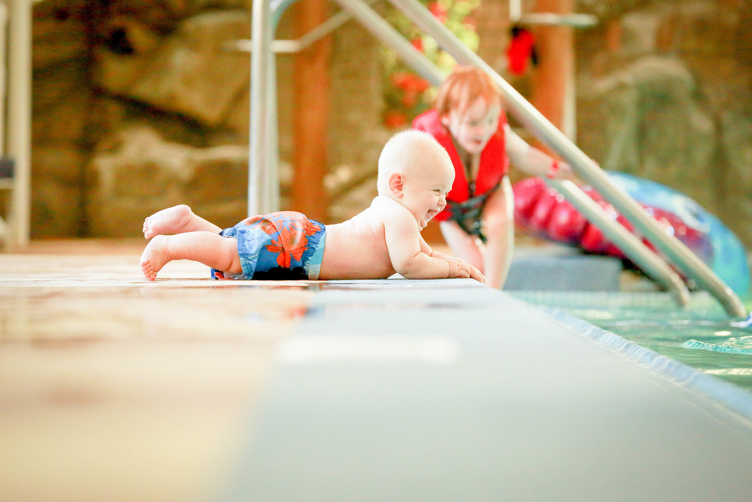
Splash pads are a great microcosm of this conversation. We the Parents recently published a blog entitled “43 Ways Our Kids Thrive On Free Play” which lists the many cognitive, social, psychological and emotional benefits free play has on kids of all ages and abilities.
Based on this basic understanding of a splash pad, and free play, it’s safe to say that anything that adds to the active, free play value of the pad is a benefit. In that same light, anything that detracts or curtails play is a detractor.
What do we mean by the latter statement? Risk is, after all, an important part of play. In the book “The Design of Childhood,” Alexandra Lange walks through the world of children, from home, to street, to classroom and playground, and she writes: “Spaces should be designed with hazards kids can see, like heights, not those they may not, like nets or uprights that can trap heads or limbs” (239)
Risk is one of the reasons free play is so beneficial, because it allows kids to evaluate their environment and push themselves. The risk needs to be visible and contribute to play, anything else is just a hazard.
The following are examples of instances in splash pad design where a difference in perspective has negatively impacted one user group over another:
Kids’ have thinner skin and burns can occur four times faster than they do in adults. If a splash pad has metal grates or hot concrete, these might not signal danger to adults, but kids can experience third degree burns on bare feet, hands and knees before adults even register the heat. (x)
In the same vein, many adults argue that the main reason kids fall on a splash pad is because the surface is slippery, and consequently abrasive coatings are added to reduce slipping. Slipping on a splash pad because of a slippery surface is true for many adults, but this doesn’t shed light on the slip and fall issues facing playing children. Active and normal play will often result in tumbling, kneeling, and rolling. In fact, there are many splash pad users who will fall regardless of what they’re doing (think wobbly toddlers). With an abrasive coating as a design solution, kids literally fall onto a hazard that they cannot measure or see.
Moving Forward with Humane Design
Humane design doesn’t always have to be a massive change. Sometimes it can be a simple adjustment like adding water-use wheelchairs or extending facility hours for kids with sensory needs. Ultimately, we believe the best way forward is to open up communication, listen to the diverse user experience, and practice regular review of safety standards.

